What is This Sheet? A Bottom Sheet for MAUI

What is This Sheet? A Bottom Sheet Component for .NET MAUI
Overview
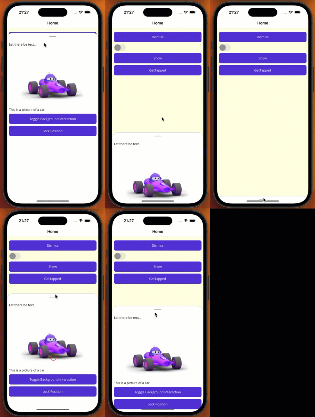
We frequently get requests for a bottom sheet-like component similar to the one from the material design library for MAUI. The basic idea is that some pinned content on the bottom of the screen can be expanded and collapsed. This seemed straightforward, but the complexity of this control is in the nuance. My first inclination to build this was to use something like the MAUI Community Toolkit Expander control. While this is an excellent control for a simple view expansion example, it doesn’t allow more advanced controls like drag-to-expand and multiple expansion stops. This meant the best solution was to cook up a custom control, as shown in the example below.

Library
Source Code
Solution
I wanted to make a control that was relatively easy to set up and offered the most common features, including:
Sliding Panel The bottom sheet slides up and down, providing a smooth user experience.
Customizable Content You can customize the content of the bottom sheet according to your needs.
Gesture Support The bottom sheet supports user gestures, allowing users to drag it up or down.
Partial and Full Expansion The bottom sheet can be expanded partially or fully based on the content size or user interaction.
Programmatic Control You can show and dismiss the control on demand
Toggle Background Interaction Allow or disallow a user from interacting with background content while the sheet is being displayed.
Usage
Setup
The first thing to do is import the namespace for the control using the http://what.is.this.sheet/schemas/controls namespace.
<ContentPagex:Class="MauiDrawer.Sample.MainPage"xmlns="http://schemas.microsoft.com/dotnet/2021/maui"xmlns:x="http://schemas.microsoft.com/winfx/2009/xaml"xmlns:wits="http://what.is.this.sheet/schemas/controls">...</ContentPage>
Once configured, you can add your BottomSheet control to your user interface. Here is an example of how you might use a bottom sheet in your app.
<wits:BottomSheetx:Name="MainBottomSheet"><wits:BottomSheet.SheetStops><wits:SheetStop Measurement="Fixed" Value="20" /><wits:SheetStop Measurement="Percentage" Value=".33" /><wits:SheetStop Measurement="Percentage" Value="0.0" /></wits:BottomSheet.SheetStops><StackLayout Padding="8" Spacing="8"><Label HeightRequest="80" Text="Let there be text..." /><Image Source="dotnet_bot.png" /><Label Text="This is a picture of a car" /><Button Clicked="ToggleBackgroundInteraction_Clicked" Text="Toggle Background Interaction" /><Buttonx:Name="LockPosition"Clicked="LockPosition_Clicked"Text="Lock Position" /></StackLayout></wits:BottomSheet>
Quick Configuration
Sheet Stops
The SheetStops property allows you to configure where the bottom sheet will want to naturally stop. This can be configured as a Fixed value in points or as a Percentage using a double value where 1.0 represents the top of the page and 0.0 represents the bottom.
Allow Background Interaction
The AllowBackgroundInteraction property controls whether or not the user can interact with background elements when the bottom sheet is being displayed. This can be handy to disable when you are using the bottom sheet as more of a modal presentation.
Bottom Sheet Considerations
Once this is setup, you can start adding the control to your UI. To best use the control, consider the following suggestions.
Use a Grid as the Parent
I may get around to creating a custom layout for this, but until then, the Grid is the best layout container for this control. The Grid allows you to control the overall positioning of the sheet in relation to the underlying content. Additionally, the Grid can specifically set the Z-Index for the control. When adding a bottom sheet to your UI, you will almost always want to add it as the last control to your grid or ensure it has the highest Z-Index. It is also possible to use AbsoluteLayout and FlexLayout, but it is going to be a huge pain in your ass and is certainly not recommended.
Be Mindful of the Margin and Padding
The padding set on a parent layout will push in the content of your bottom sheet control. If you want to take up the the full width, use a negative margin. The example below shows how to use a negative margin to have the bottom sheet take up more of the UI while still allowing the underlying content to be padded in.
<GridPadding="8">...<wits:BottomSheetx:Name="MainBottomSheet"Margin="-8"></wits:BottomSheet></Grid>
Use the IgnoreSafeArea on the parent layout
In the layout hosting your bottom sheet, set the IgnoreSafeArea to true. This will give the bottom sheet a better appearance at the bottom of iOS devices.
